Pattern Drenching Done Right: How to Mix Prints Without It Looking Chaotic
Isle Theory Editorial Team
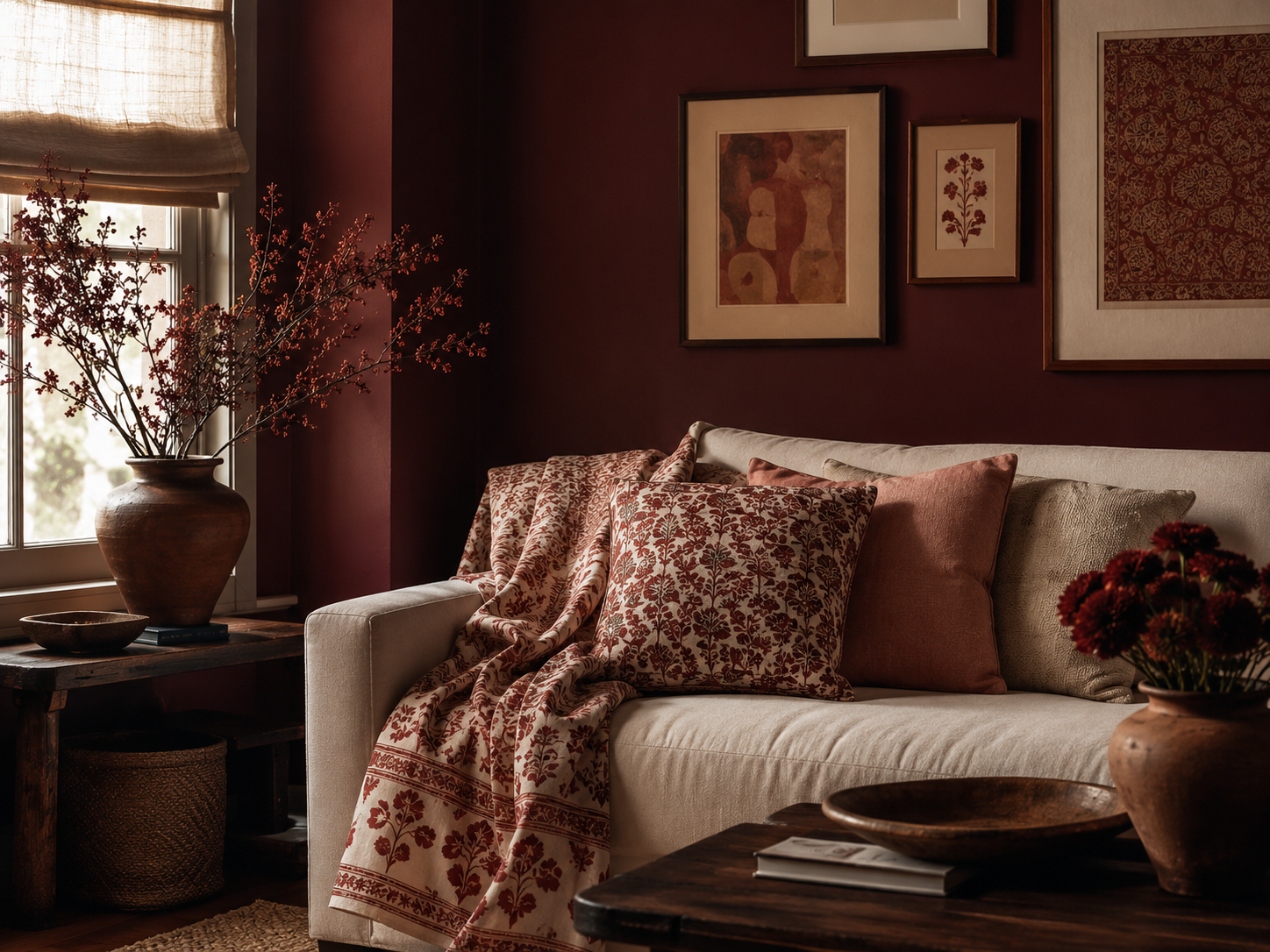
Pattern drenching interior design sounds like it should be terrifying — the idea of layering print on print until a room has a single, unmistakable identity sounds like a fast way to make a space feel like it’s vibrating. But the rooms that actually pull this off don’t feel chaotic. They feel intentional, almost architectural, like the pattern was always meant to be the room’s whole personality rather than one loud decision competing with six others.
The trend has real staying power going into 2026, and it isn’t limited to walls. Designers are applying the same “drench the whole room” logic to paint color, to layered textiles, and even to art — there’s a related move some designers have started calling “book drenching,” where a wall of well-loved titles becomes the room’s dominant visual texture, the same way a bold paint color or a print would. The common thread across all of these isn’t wallpaper specifically. It’s commitment: picking one strong visual idea and letting it run through a room instead of hedging with a little bit of everything.
This guide covers four ways to build that effect without wallpaper: painting the whole room in one saturated color, layering textiles that share a print family, grounding the floor with a patterned rug, and using a cluster of framed art as the room’s “pattern” instead of a printed surface. Each is lower-commitment than a full wallpaper install, and several are renter-friendly.
Start With Color Drenching — the Walls, Trim, and Ceiling in One Shade
If wallpaper isn’t the direction you want, color drenching is the layer that does the most work with the least commitment. The technique is straightforward: paint the walls, trim, and often the ceiling in the same color, varying only the sheen between surfaces. Removing the usual white-trim contrast makes a room read as one continuous, immersive space rather than a box with edges — and paint experts consistently point to it as one of the defining application trends heading into 2026, alongside a newer variation called “color capping,” which uses a tonal gradient instead of one flat color throughout.
Warm, saturated tones tend to work best for this — the deep blues, greens, and earthy reds that paint brands have been leaning into for 2026 read as cozy and grounded rather than cold, especially compared to the gray-heavy palettes of the last several years.
Potters Clay 1221 (Benjamin Moore)
A warm, sunbaked terracotta orange from Benjamin Moore’s Classic Color Collection — a color-drenching candidate that reads as grounded and earthy rather than trendy-bright, and pairs naturally with the block-print and floral textiles below.
Layer In Textiles That Share a Print Family, Not an Exact Match
Once the walls are set, the instinct is to match everything else to the wall color exactly. Don’t. The rooms that read as “collected” rather than “matchy” use a second and third pattern that shares a color story with the walls — without repeating it outright. Several designers describe the strongest pattern-drenched rooms as pairing things like florals with stripes, or antique-feeling textiles with patterned upholstery, so the prints speak to each other rather than match perfectly.
Hand block-printed textiles are a natural fit here, because the slight irregularity of the printing process already gives each piece a one-of-a-kind quality that keeps a room from feeling too uniform, even when the palette is tightly coordinated.
Luxor Saffron Linen Cushion (Walter G)
A hand block-printed cushion cover in 100% linen, featuring a directional palm motif in warm saffron tones — printed by artisans in a warm colorway that pulls from the same family as a terracotta or clay-toned wall without repeating the exact color. Pipe-edge finish, pattern on both sides.
Ground the Room With a Patterned Rug
The floor is where a lot of pattern-drenched rooms either come together or fall apart, because a rug this size is the hardest layer to swap out on a whim if it doesn’t work. The safer move is a rug in the same color family as the walls and textiles, in a softer or more diffused version of the pattern — a watercolor floral rather than a sharp block print, for instance — so it reads as a base note rather than a third competing pattern.
Washable rugs have made this lower-stakes than it used to be, which matters in a room that’s already asking a lot of its other surfaces.
Watercolor Floral Multicolor Rug (Ruggable)
A machine-washable area rug in a softer, painterly floral, made to layer under a saturated wall color without competing with it. Stain-resistant cover system with a separate non-slip pad, which makes it realistic to keep clean in a high-traffic living room.
Wall Art Drenching: The Lowest-Commitment Way to Add Pattern
If color, textiles, and a rug already feel like plenty of change, a cluster of framed art can do the job pattern usually does — giving a wall a dense, layered focal point — without touching paint or paper at all, and it’s the easiest of the four layers to undo if it doesn’t work. A tightly grouped gallery wall, hung with intention rather than scattered piece by piece, reads as its own kind of “drenching”: the eye can’t find a single blank spot to rest on, which is exactly the effect a printed wall is going for.
Pre-curated art sets take a lot of the guesswork out of scale and spacing, since the pieces are chosen to work together as a group rather than assembled one purchase at a time.
The Curator Gallery Wall Set (Society6)
A pre-curated set of framed art prints designed to be hung together as a single grouping, mixing bold colors, varied textures, and different styles for a collected-over-time look rather than a matched set. Individual framed prints in the set are sold separately, so the room’s palette can be built one piece at a time.
Pattern Drenching Interior Design: The Three-Layer Ceiling
Most designers working in this style land on roughly the same practical limit: three strong layers feels intentional, four or more starts to feel like clutter unless it’s a deliberately maximalist room. For a first attempt, a reasonable structure is one dominant layer (the color-drenched walls), one supporting layer (textiles), and one quiet layer (the rug) — with a gallery wall used instead of, not in addition to, one of the others if the room is small.
A few other things worth knowing before starting:
- Color discipline matters more than pattern discipline. Several layers in a tight, consistent color palette read as curated. The same layers in different color stories read as random, even if each one is beautiful on its own.
- Test the paint color at full scale before committing to trim and ceiling. A large sample swatch, viewed in the actual room across a full day of light, tells you far more than a chip at the paint counter.
- Solid surfaces are doing real work in this look, not just resting. A heavily layered room still needs somewhere for the eye to land — a solid sofa or solid drapery both serve that purpose.
Pattern Drenching FAQ
Do I need wallpaper to pattern drench a room?
No. Wallpaper is one option among several, not a requirement — color drenching (one saturated paint color across walls, trim, and ceiling), layered textiles, and a densely hung gallery wall can all create the same immersive, “one strong idea” effect that pattern drenching is going for, often with less commitment and lower cost than a full wallpaper install.
Is pattern drenching still in style, or is it already fading?
Multiple designers point to pattern, alongside color drenching, as one of the defining directions for 2026 rather than a passing moment — described as a genuine pushback against several years of cool, minimal interiors rather than a short-lived maximalist spike. That staying power is exactly why pattern drenching interior design has held up as a real trend rather than faded after one season.
Do the patterns have to be the exact same print everywhere?
No, that’s actually one of the more common misreadings of the trend. Some designers point out that pattern drenching doesn’t require using one identical print throughout; layering elements that share a color palette, like a saturated wall color paired with a block-print textile, achieves the same immersive effect without feeling repetitive.
What room should I try this in first?
A smaller, lower-commitment space — a powder room, a reading nook, or a single accent wall — is the easiest place to test whether you actually like living with a heavily layered room before committing to a full living room.
Isle Theory Editorial Team
Read Next
A weekly edit of beauty, style, and the good life.
No spam. Unsubscribe anytime.