Isle Theory Editorial Team
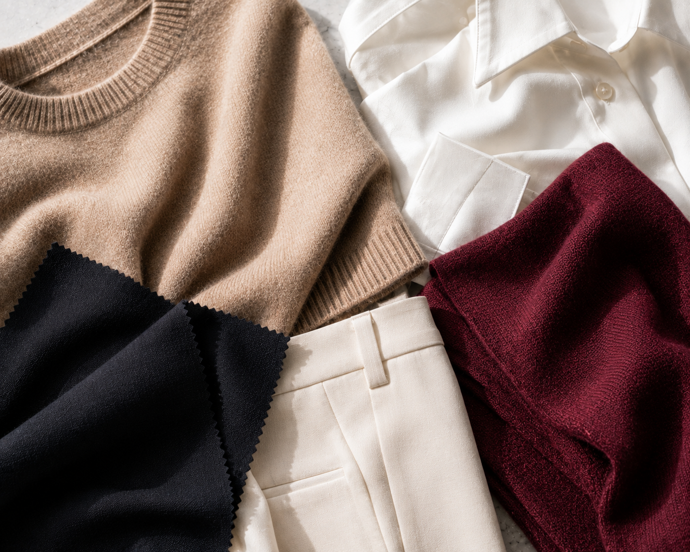
A capsule wardrobe color palette is the difference between a closet where every piece works together and a closet full of things you love individually but can never actually combine. If you’ve ever stood in front of a full rail of clothes and felt like you had nothing to wear, the problem usually isn’t quantity — it’s that your pieces were never chosen against a shared palette in the first place.
It’s a small, deliberate set of colors — one neutral base plus a couple of accent colors — that every piece you buy has to answer to. It’s not a mood board and it’s not a single “favorite color.” It’s closer to a rule: before a piece enters your closet, it has to work with the palette that’s already there.
Most capsule guides tell you to “just pick neutrals” and stop there, which is true but incomplete. A palette without a clear anchor color and a clear accent color is still just a pile of things that happen to be beige. The pieces that actually earn their keep — the ones you reach for on repeat — are the ones chosen against a system, not against a Pinterest board built in isolation from what’s already hanging in your closet.
If you haven’t settled on your core pieces yet, start with our capsule wardrobe framework, then come back to build the palette around it.
Building one doesn’t require a color theory degree. It requires picking, in order: one base, a small set of accents, and a test to confirm the whole thing actually holds together.
Start with a single neutral that will anchor your hardest-working pieces — trousers, coat, bag, shoes. Your options are usually black or charcoal for a cooler, sharper base; camel, cream, or chocolate for a softer, warmer one; or navy as a slightly less severe substitute for black. Pick one. Not two, not “whichever I feel like that day” — one base color that every other piece in the capsule gets measured against.
Once the base is locked, add two or three accent colors that show up more sparingly — in a sweater, a scarf, a pair of shoes, never in more than one or two pieces at a time. Analogous colors (colors that sit next to each other on the color wheel, like rust and burgundy) tend to feel cohesive without much effort. Complementary colors (opposites on the wheel, like navy and rust) read more vibrant and take slightly more confidence to wear well. Either approach works — the point is picking accents on purpose instead of by impulse.
Here’s the test that separates a working palette from a wish list: you should be able to describe your entire capsule wardrobe color palette in one sentence. “Black, cream, camel, and muted rust” passes. A list of eight unrelated colors that all happened to catch your eye in a given season does not. If you can’t say your palette out loud in under ten words, it’s not tight enough yet — go back and cut, not add.
Here’s the piece most capsule wardrobe guides skip entirely: your skin’s undertone changes which version of “neutral” actually looks good on you, and getting this wrong is why a palette can be technically correct and still feel off every time you put it on.
Cool-toned skin — with pink, red, or blue undertones — tends to read cleanest against black, navy, crisp white, and cool grey. Warm-toned skin — with yellow, golden, or peachy undertones — tends to look more harmonious in ivory, camel, olive, and soft brown. If you’re not sure which you are, Healthline’s guide to identifying your skin undertones walks through a few quick at-home checks, including the vein test and the gold-versus-silver jewelry test, that take about two minutes and make the rest of this decision much easier.
This one adjustment — choosing your neutral base to flatter your undertone rather than picking whichever neutral is trending — is the single biggest lever most capsule wardrobe advice leaves out.
A capsule wardrobe color palette is easier to understand with an actual example than with more theory, so here’s a real one, built from pieces that are genuinely available right now rather than a styled fantasy closet.
Base: Oatmeal, a warm, camel-adjacent neutral. Second neutral: Black, cool and sharp, for the pieces that need more edge than oatmeal can give them. Accent: Rich Burgundy, used sparingly, in exactly the amount that keeps it feeling like an accent instead of a second base.
Said out loud, that’s the whole palette: oatmeal, black, and rich burgundy. Three colors, one sentence, done.
Here’s how those three colors show up across four pieces that anchor the capsule:
Four pieces, three colors, and every one of them works with every other one — which is the entire point of building a capsule wardrobe color palette instead of shopping piece by piece.
Most capsule wardrobe color palettes work best with three to five colors total: one neutral base and two to three accent colors. The real example above uses three — oatmeal, black, and rich burgundy — which is on the minimal end and easier to keep coherent than a palette pushing toward six or more.
Yes. A second neutral — like pairing a warm oatmeal with a cooler black or navy — is common and useful, especially if your undertone doesn’t fully commit to one temperature. The key is still picking on purpose: two neutrals that were chosen to work together, not two neutrals you happened to already own.
It helps, but it isn’t a hard rule. Undertone-matching makes your base neutral look more effortless against your skin, but personal preference and how a color makes you feel should always outrank a chart. If you love a color that technically fights your undertone, the fix is usually to keep it as an accent rather than the base — not to avoid it altogether.
We research and select every product featured on Isle Theory. Our recommendations reflect independent editorial judgment, not paid placement.