Isle Theory Editorial Team
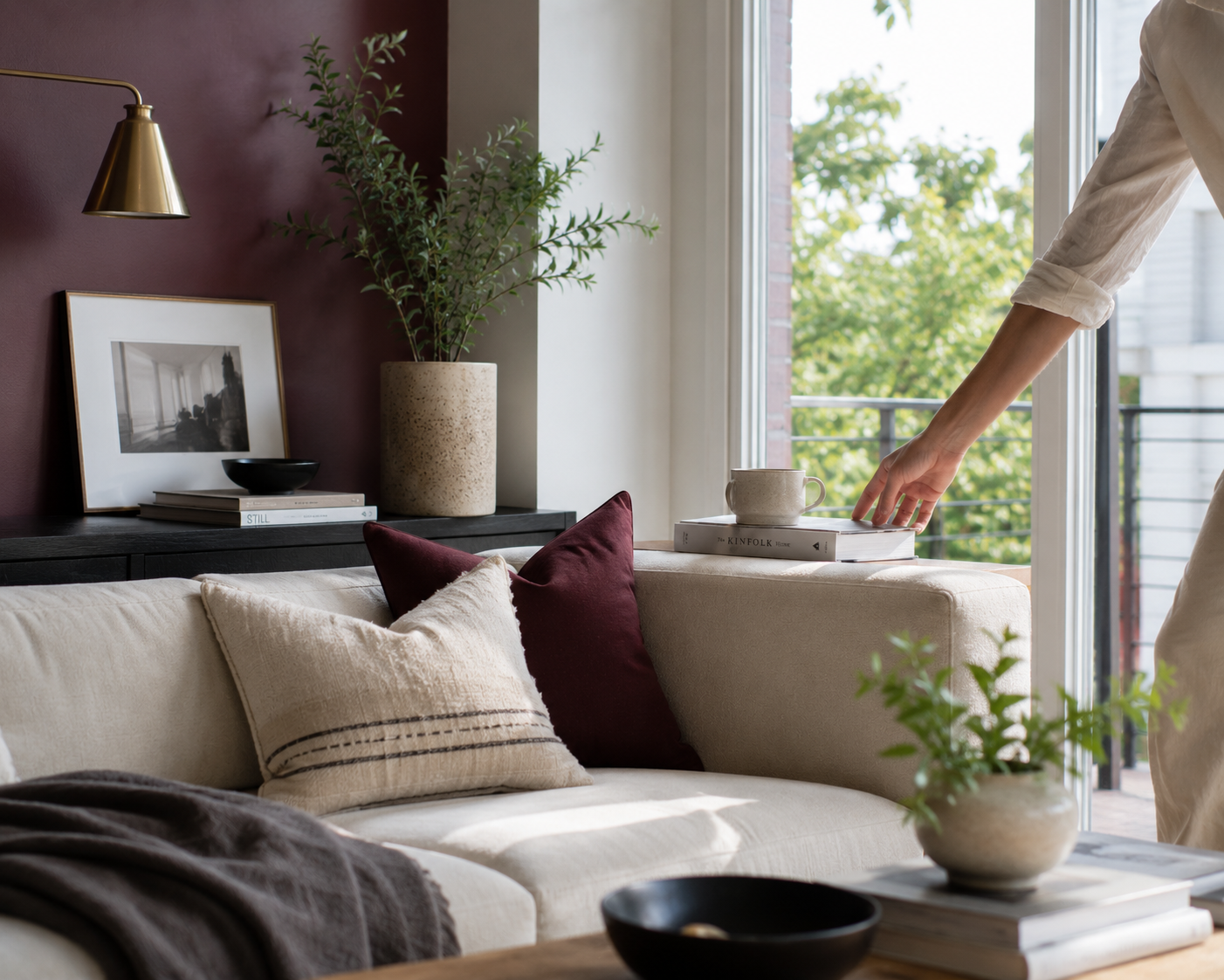
Burgundy living room decor is having a real moment heading into 2026, and it’s easy to see why. It’s warmer than a true red, more grounded than jewel-toned purple, and it works with almost every metal finish in a room. But scroll through most of what’s been written about it and you’ll notice a pattern: burgundy gets treated like a mood. Dim the lights, layer the velvet, close the curtains, call it “cocooning.” We love a rich color. We just don’t think it has to mean a dark room.
Burgundy’s momentum isn’t a guess. Graham & Brown named a deep, damson-toned burgundy its 2026 Color of the Year, describing it as a shade that shifts with the light — lighter and brighter when it’s freshly applied, settling into its full depth as it cures. Paula Taylor, the brand’s senior stylist and trend specialist, has called the color dramatic but polished rather than heavy-handed, and that distinction matters for how we’re framing this piece. A saturated color and a somber room are two different design decisions. You can absolutely have one without the other.
Here’s where most burgundy content goes wrong, in our opinion: it assumes the color needs to be softened with low light and heavy drapery to feel intentional, as if saturation itself were the problem. It isn’t. The heaviness readers are picking up on in a lot of these rooms usually comes from the supporting choices — warm, dim lighting; dense, floor-length curtains blocking daylight; no contrast color anywhere in the frame — not from the burgundy itself. Swap those choices out and the exact same wall color reads as confident and current instead of dark and dated.
We’ve broken this down into seven practical moves. None of them require repainting your entire home, and most can be layered in gradually.
A lot of paint marketed as “burgundy” actually reads closer to brick or clay once it’s on a wall. If the depth and cool undertone are the whole point, it’s worth choosing a shade that’s been developed specifically in that damson-plum family rather than a warm earth tone with a burgundy label slapped on it.
Graham & Brown’s 2026 Color of the Year — a deep damson-plum with hints of mulberry and garnet, developed specifically to read as rich rather than muddy. Available in an ultra-flat matte and an interior eggshell finish; the brand recommends three coats for full, even depth.
Burgundy absorbs light differently than pale neutrals do, so a room that leans on warm bulbs and dim corners will always tip the color toward heavy. Before changing anything else, look at how much genuine daylight the room gets and whether curtains, furniture placement, or dark lampshades are cutting it off unnecessarily.
This is the single biggest lever in the entire list, in our opinion. Burgundy paired with black, charcoal, or another deep tone will always read as a cocoon. Burgundy paired with cream, warm white, brass, or a fresh green reads as a considered, editorial color story. Consider a cream sofa against a burgundy wall, or a green plant as the one cool note in an otherwise warm room.
If a full accent wall feels like a big first step, textiles are the lower-risk entry point — a velvet throw pillow or two does a lot of the same visual work as paint, and it’s reversible if the room’s overall feel changes.
A medium-sheen velvet pillow in a true burgundy — the kind of saturated color that catches and reflects light rather than absorbing it flat, which is exactly the texture quality this room needs. Designed and made in Vancouver; available in 17×17, 20×20, and 12×20 sizes.
Brass does a lot of the same emotional work that warm lighting is often used for — it reads as inviting and a little glamorous — without dimming the room the way amber bulbs or heavy shades do. A pair of brass candle holders on a mantel or console gives a burgundy room warmth on the color’s own saturated terms, not by muting it.
Cast-metal taper holders in a light or dark brass finish, with an organic, slightly irregular silhouette that keeps them from reading too formal. A simple way to bring warm metal into a room without adding another dark surface.
Pattern- and color-drenching (fully immersing a room in one tone, walls to textiles) is its own valid look, and we’ve covered it separately — but it’s not the only way to use a strong color, and it’s not the direction this piece is making the case for. One wall, one sofa, or a well-chosen rug reads as a deliberate accent. Four walls plus drapery plus upholstery in the same tone is the move that tips a room from “rich” to “heavy,” regardless of which burgundy you picked.
Floor-length, densely lined curtains are doing a lot of the “cocooning” work in most of the burgundy rooms circulating right now, and they’re also the easiest thing to change back. A lighter linen or a shorter, simpler window treatment lets the daylight from move #2 actually reach the room, which does more for the “not heavy” goal than almost any other single choice on this list.
Burgundy earned its spot as one of 2026’s defining colors because it’s genuinely versatile — it’s just been photographed and written about almost exclusively in its moodiest, dimmest form. The color itself isn’t the problem. Daylight, contrast, and restraint on how much of a room it covers are what separate a bright, current take on burgundy living room decor from the same dark, cocooning look everyone else is publishing.
It can, but that has more to do with lighting and how much of the room the color covers than the color itself. A single accent wall or a few burgundy living room decor pieces, paired with real daylight and a lighter contrast tone, tends to read as rich rather than cramped. Four dark, saturated walls with no contrast and minimal daylight will feel small in almost any deep color, burgundy included.
Cream and warm white are the most reliable contrast partners, since they keep the room from tipping fully dark. Brass and other warm metals add glamour without adding more darkness. A fresh green — either painted or brought in through plants — is a less expected but very effective third option, since it reads as alive and current rather than moody.
Deep, saturated reds have shown real staying power over the past several seasons rather than appearing and disappearing in a single year, and Graham & Brown’s decision to name a burgundy-adjacent shade its 2026 Color of the Year suggests the momentum isn’t slowing. That said, trend longevity is genuinely hard to predict with certainty, and anyone choosing a paint color for their own space should weigh how much they personally love it over how long a color trend is expected to last.
No — textiles and accents are a lower-commitment way to test whether burgundy works in a space before painting anything. A velvet throw pillow or a set of brass candle holders can establish the color story, and a wall or larger piece of furniture can follow later if the smaller pieces feel right in the room.
We research and select every product featured on Isle Theory. Our recommendations reflect independent editorial judgment, not paid placement.